So, this is a suggestion, but I would also categorize this as a bug so…
Tabs are visible, but could be fixed (I suggested this before, this goes more in depth etc.)If possible, it would be nice to make the tabs black, or gray. It would be more visible and improve the Trivnab theme on the forum. The category tab, on the top with Categories, Latest, New, Unread etc are white and black when selected, if the top tabs were changed to that, it would be much more visible and match the theme more.
All of these are different characters, the lowercase L, I and exclamation mark look identical, hard to pick out, if this could be fixed that would help everyone who uses the theme. I know that it’s pretty easy to see if it’s an L. I etc but sometimes, it’s confusing, so a simple fix to this would be very helpful.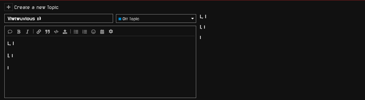
If you have any questions, I guess just ask me. But I hope this is relatively straight forward.
if you aren’t able to pick out characters for 2nd image here’s the key
Capital L, Lowercase L
Capital I, Lowercase I
Exclamation mark.