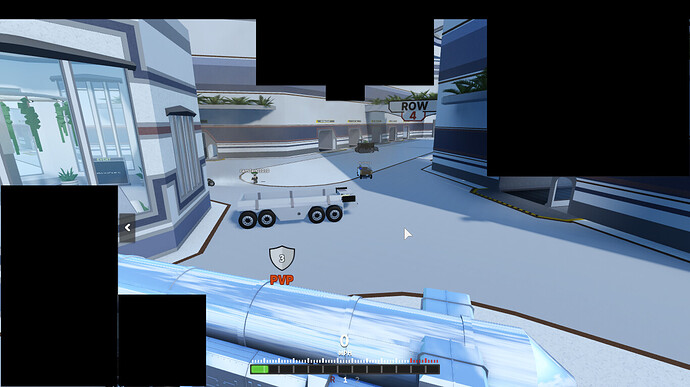
Currently, when everything is expanded it takes up a good chunk of screen space. i understand that that’s why it was made collaspible in the first place, but ideally it shouldn’t need to be collapsed down. i took a screenshot of the game on my display and blackened all of the screen estate taken by the UI so that gimp could tell me how much of the screen was taken by ui based on B&W values, and 33.5% was taken up by gui.
there are multiple ways one could solve this- for example, inclusion of an in-game scale slider and a compact view would go a long way- eg showing icons but not the text that would be visible in a fully expanded view, and trimming whitespace. an idea of what that might look like ingame, badly thrown together in about 15 mins in gimp.
some other possibilites include lining the bottom of the screen with the different currency counts, like money and coins, with a small version of the icon and the name above each one, which keeps the center of the screen clearer, or putting all information into the same topbar that currently has the twitter handle.

